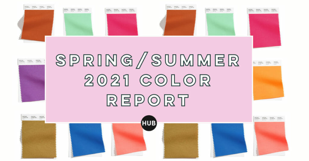
Pantone Color Institute has released the Pantone Fashion Color Trend Report for Spring/Summer 2021. We couldn’t be more excited for the fashion to come this spring/summer in these gorgeous color combos.
These mood-boosting colors will give you insight into what colors to look out for when buying your spring inventory. We all know how exciting a pop of color can be after a long neutral filled winter!
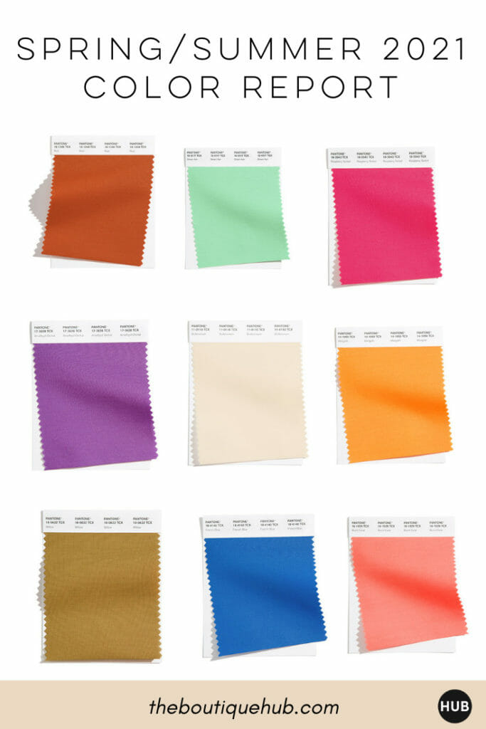
Below we listed all 15 of the shades Pantone Color Institute we released. Time to get inspired #boutiquebosses!
“Offering a range of shades illustrative of nature, colors for Spring/Summer 2021 underscores our desire for flexible color that works year-round. Infused with a genuine authenticity that continues to be increasingly important, colors for Spring/Summer 2021 combine a level of comfort and relaxation with sparks of energy that encourage and uplift our moods,”
Leatrice Eiseman, Executive Director of the Pantone Color Institute.
From left to right:
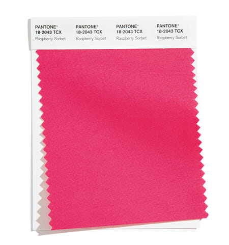
PANTONE 18-2043 Raspberry Sorbet: Vivifying Raspberry Sorbet tantalizes.
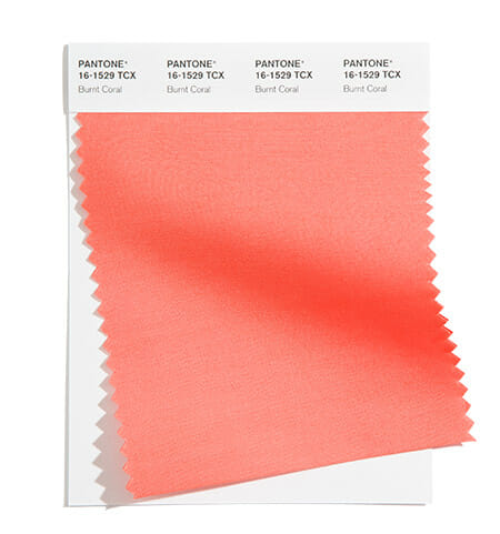
PANTONE 16-1529Burnt Coral: Inviting Burnt Coral expresses conviviality.
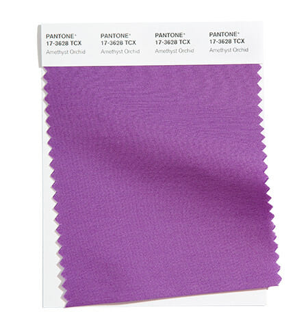
PANTONE 17-3628 Amethyst Orchid: The floral shaded amethyst orchid introduces a unique touch.
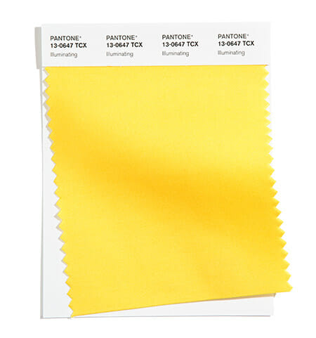
PANTONE 13-0647 Illuminating: Friendly and joyful, an optimistic yellow offering the promise of a sunny day.
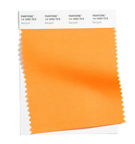
PANTONE 14-1050 Marigold: A comforting golden orange infused yellow lends a warming presence.
From left to right:
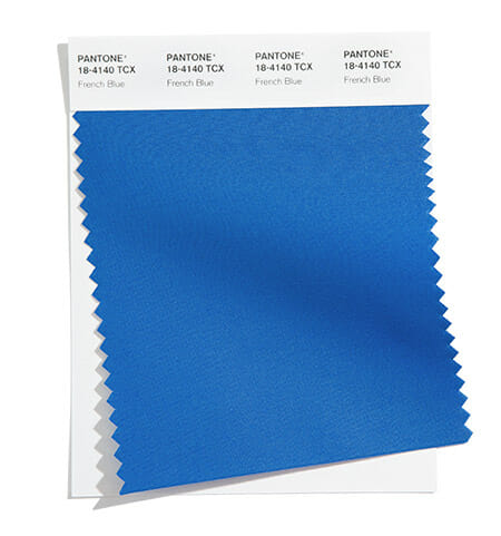
PANTONE 18-4140 French Blue: A stirring blue hue that awakens a vision of Paris in the springtime.
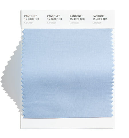
PANTONE 15-4020 Cerulean: The color of the sky on a serene, crystal clear day.
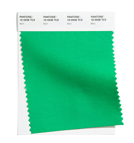
PANTONE 16-5938 Mint: Tasty mint refreshes and restores.
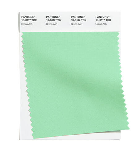
PANTONE 13-0117 Green Ash: A mentholated Green that cools and soothes.
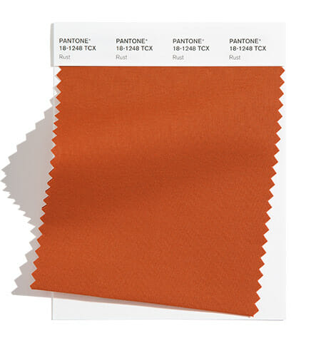
PANTONE 18-1248bRust: An earth-inspired brown emblematic of Autumn leaves uncharacteristic of a spring palette.
From left to right:
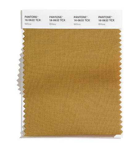
PANTONE 16-0632 Willow: A canopy of green that reveals and conceals.
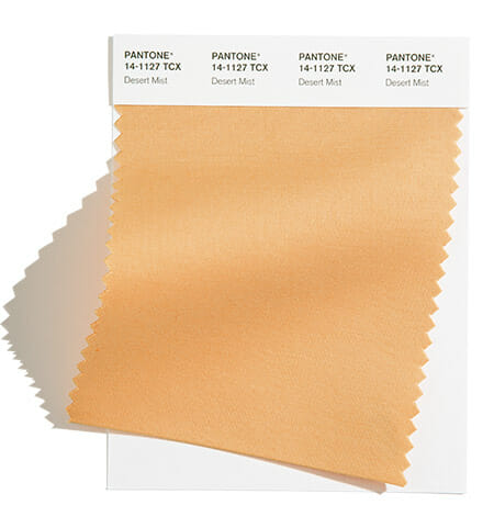
PANTONE 14-1127 Desert Mist: Invoking images of shifting powdery sands
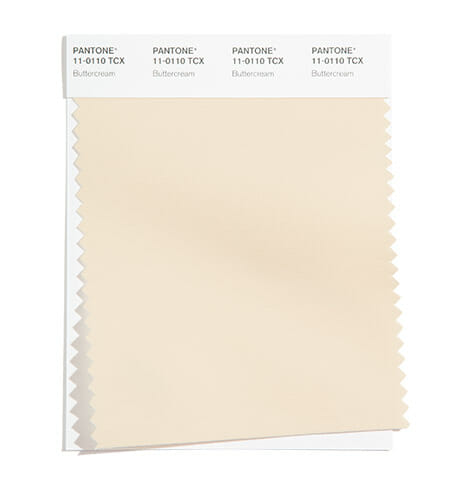
PANTONE 11-0110 Buttercream Smooth: Buttercream is an easy and effortless delicious off-white.
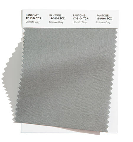
PANTONE 17-5104 Ultimate Gray: Quietly assuring and reliable gray encouraging composure.
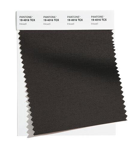
PANTONE 19-4016 Inkwell: A deep and intense blackened blue.
Join Ashley Alderson, Boutique Marketing Expert, and Founder of The Boutique Hub to walk through 6 Key Areas to maximize this holiday season. Join Holiday Marketing Masterclass!

From content planning, eCommerce, and events to profitable promotions, team training, and traffic….this is the most sought after Holiday training program online. And it’ll impact your business all year long!
SIGN UP FOR EMAIL UPDATES ON OUR WEBSITE:
https://theboutiquehub.com/boutique-summit-2020/
Join the Hub for more training, information, and connections.
www.theboutiquehub.com/join
Recent Posts: